Maintaining the integrity of your brand is essential for long-term success. However, Trillion often encounters third-party logo design files that do not appear to have the highest care when created. The logos in question come to us in the form of a sponsor logo, an affiliate logo, and a certificate or award logo.
The following points are often enough that we think it is important to provide guidance so that you can avoid these pitfalls. With the help of a graphic designer, the issues of this logo below can be solved and fixed if you ever consider it in your own logo.
1. Bad lines in the logo
When the characters and design elements in the logo are drawn or modified, great care should be taken by the graphic designer. The lines and dots inside the logo should be smooth and clean. In the logo design example below, you will see how the inside line of the letter does not have a curve towards it. This is one of the most common problems we see in poorly made logos.
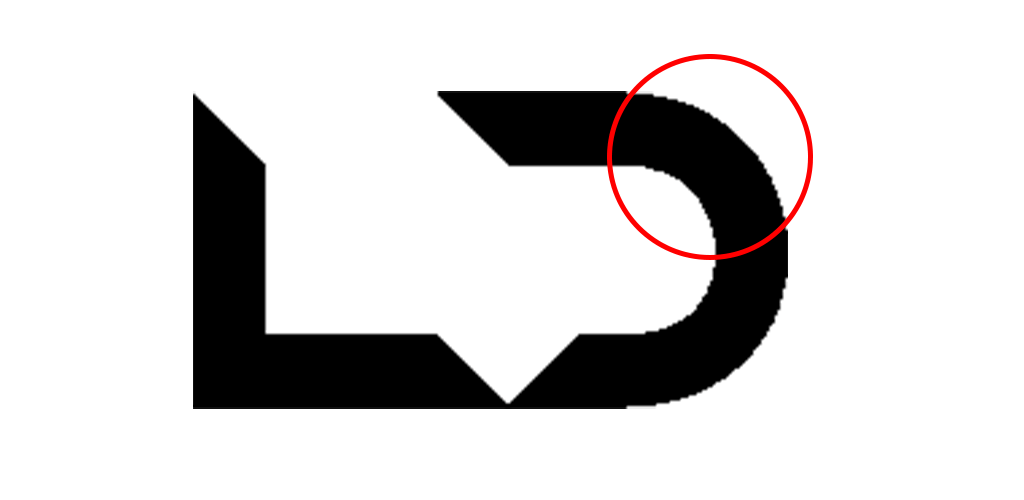
Logo files are made up of many dots and lines. When the logo is small, these imperfections may not be significant, but as the logo gets bigger the issue becomes more obvious and problematic. You should have a graphic designer who will fix the curves and lines of the logo. Then use the new files to replace the problem logo.
2. Improper Alignment of Logo Elements
Since graphic designers create logos, they are composing letters and design elements. They have complete control over the sizing and alignment of objects. With all this control, and especially the number of elements or characters is likely to increase that something does not adjust as it should.
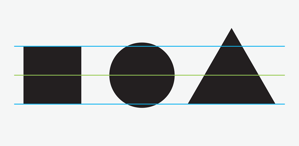
As with the “bad lines” example above, a small logo size can hide problems when compared to an extended version. But on the screen or in digital access, cutting your logo the wrong way causes it to look blurry (due to pixel interpolation, solid dark pixels are divided into multiple lighter pixels). Graphic designers can adjust the arrangement of elements using the Snap-to-Grid or Snap-to-Guide feature, functions available in Adobe Creative Cloud software. This process will ensure that items are arranged just like your logo.
3. Missing Font in Logo
A logo design should always be presented as a piece of artwork composed of lines and points or pixels. Unfortunately, this is not always the case. If a graphic designer used a particular font in your logo, you may not have that font on your, or your vendor’s, computer. A missing font often leads to it being substituted by another font available on the computer. It’s a major problem that prevents anyone who doesn’t have the font to see the logo properly. This even holds true for a graphic designer trying to fix the problem.
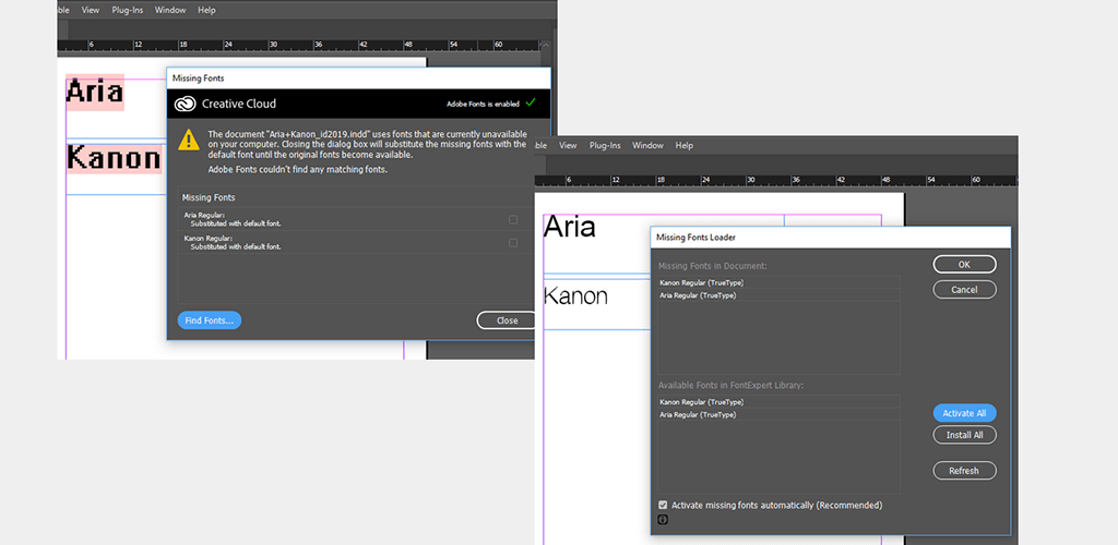
As a logo is designed, fonts are commonly used either as they are, or as a starting point to be modified for the design. The important step in the logo design process is to “outline” the letters being used in the logo so they become a piece of artwork rather than letters you can edit by typing. Once this process has been done, it is not reversible and the font will no longer be required to view and reproduce the logo. Be aware that fonts can cost between $20 and $150 or more just for one weight, such as Helvetica Neue Bold.
4. The Incorrect Logo File Format
Another one of the most common issues we see with logos that are supplied to us is that they are not in the correct file format. If your graphic designer comes to you and says “it’s not the right format” it can mean a few things. However, if your designer intends on using the logo, it is not going to work.
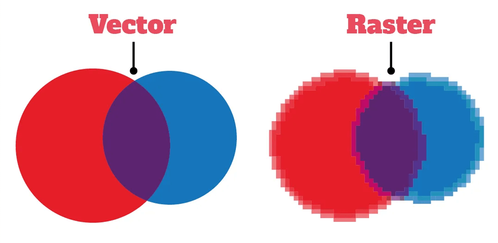
The most common incorrect file format we receive is a raster logo such as a .jpg rather than a vector logo, such as a .eps. A .jpg logo might be fine if the resolution is high enough and it does not require being produced on a color or transparent background. Vector logos will offer a graphic designer the most options, including saving the artwork to other file formats. A vector logo can be enlarged or reduced infinitely without losing quality.
5. The Incorrect Logo Color Format
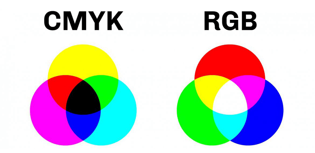
A less common but potentially more challenging logo file format issue is the color mode. A logo that is being printed on paper, on a t-shirt, or being included on a website will have different color spectrum requirements. Some can be easily converted from one to another but others cannot. Again, a vector logo will offer a graphic designer the best chance to fix the issue.
Logo Design Done Right
Providing our clients with logo designs and all of the necessary file formats they might need is an important part of our creative process. Once our design has been approved, we create full-color, 1-color, 2-color, black, and white (knockout) versions of the logo for both print and digital usage. We clearly label the files and place them into properly named folders, making it easy to find the right logo.

