How to add project as a library to Android Studio
There can be a situation when we need to modify the library code according to our requirement then in that case we can…
Room Database in android java
Room databases use users to store data offline. This database is very helpful and fast gives user…
How to integration google ad in android app. Part – 1
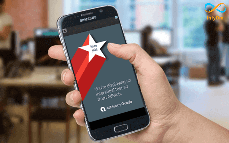
Google ad integration in android java.Very easy to add and simple flow.All Google ad type…
How to add Shadow and Text on ImageView in Android
Basically, it works like a stack where each view is stacked on top of the other. Create a drawable file for shadow view…
How to Customize Snackbar in Android
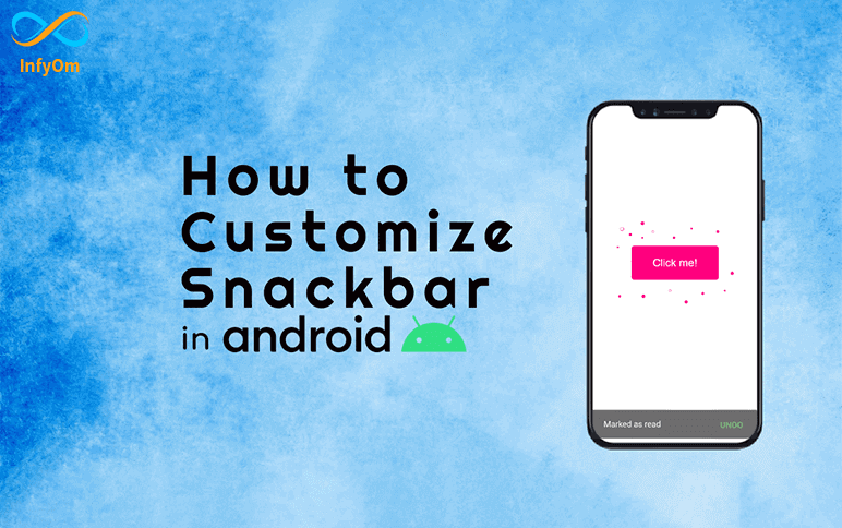
Snackbars are fairly common in the Android app. Almost every app uses a snack bar to display some information about…
How to create APK and Bundle in android java
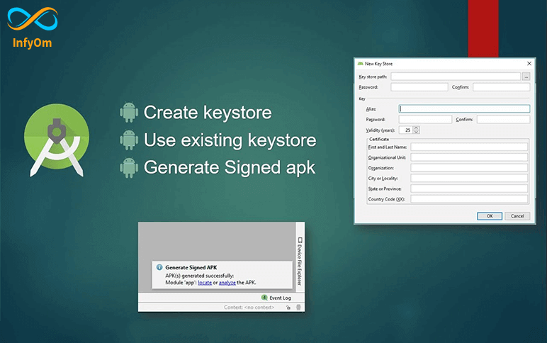
While developing apps in Android Studio, developers can create an APK file and share it with other developers or to QA…
How can I run my app on my phone without USB connection with my pc
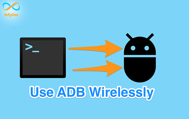
We will learn to run the app without connecting a USB cable in this blog. The main purpose of this blog is to let users…
Useful Shortcut Keys for Android Studio

Android studio shortcut key very simple and easy to understanding. Remember all androids studio short cut key and…
How to Implement Splash Screen in Android
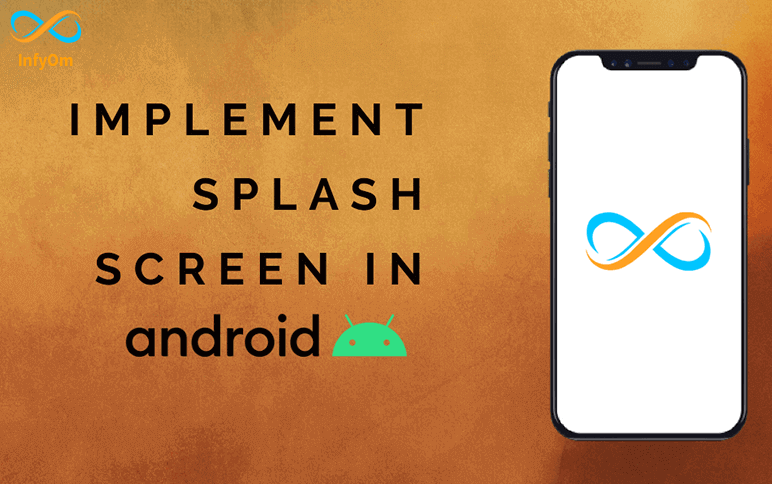
What is a Splash Screen? A splash screen is a screen that appears when you open an app on your mobile device. So, we…
How to Create Custom CardView in Android
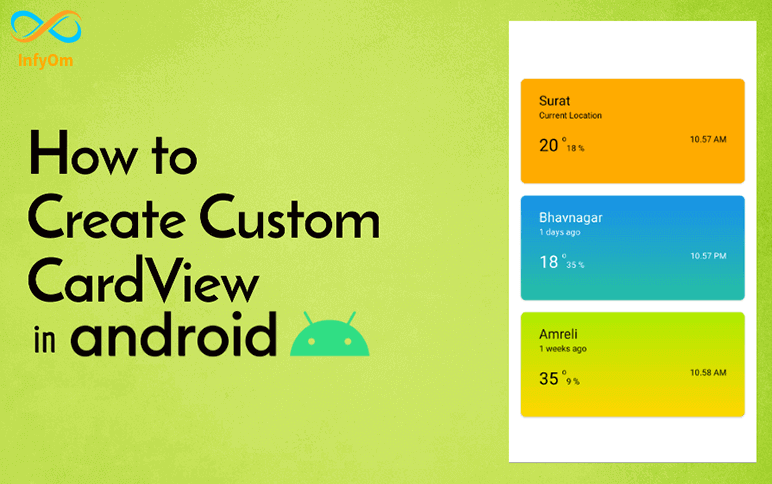
Cardview is a widget provided by Android to create a new look and functional UI. You can build your app with the…