CSS Posts

Understand FontIcon Style

Linear

It is the most common style of icon in projects. With its simplicity, it is perfect for a minimalist and modern style.

Linear Icon

Bold

These icons have a fill. We often use them to emphasize the effect of an active option in the navigation of desktop or mobile applications.

Bold Icon

Two colors / Duocolor

As the name suggests, it is a two-color style. this, we can distinguish their more important fragments.

Duocolor Icon

Bulk

It is a combination of the two colors and bold styles. this, the icons are better visible through filling, and at some time, we can emphasize their more important parts.

Bulk Icon

Broken

This style is characterized 'zed by a partial indentation in a given fragment of the icon. This effect distinguishes the icons from the rest and gives them a bit of spice.

Broken Icon

April 24, 20221 minutePayal PansuriyaPayal Pansuriya
Why Should Use CSS Variables?
A variable gives us the ability to store a value inside it and then reuse it throughout the code. CSS variables make our work easier and more manageable.

Imagine you have a large project and you have to make changes to the fonts and colors. Now, one common way to do that is by changing them all manually and individually. But this is a nightmare and there are chances that you might miss something.

But with the use of CSS variables, you can do it with a few keystrokes. You just have to change the value of the variable where you have defined it and that's it. So you see that this is where CSS variables come in handy. And CSS variables can be accessed and modified in JavaScript.

Syntax of CSS variables

.root { 
     --primary-color: #151515;
}
  • A CSS variable is defined by adding double hyphens before your property name that follows the property name.
  • The property name could be anything. You can name it whatever you want, but try giving them a reasonable name.
  • After that, you give value to that. CSS variables are case sensitive so be careful while declaring and using one.

To use a CSS variable we use a function called var(). This function recalls the value of the variable and returns it.

Use of the variable:

.title {
     color: var(--primary-color);
}

The above code will set the value of .title class selector's color to #151515.

Scopes of CSS variables :

CSS variables have two scopes

  • Global
  • Local

Global scope :

A variable is said to be in global scope if it is defined in the highest level possible. For that, we use the : root selector for declaring the variables.

:root {
    --text-font-family: sans-serif; 
}

A global scope variable can be accessed anywhere in the code. And you can also modify it.

Local scope :

We can restrict the use of CSS variables to a specific element by declaring in a low-level selector.For example, using it for a specific class.

.container {
     --main-color:#151515;
} 

.container .heading { 
     color: var(--main-color);
} 

Now this variable can only be used by .container selector or its child elements, And all the elements inside .container will initially inherit this property, but elements outside of .container cannot use it.

Overriding CSS variables :

CSS variables can be overridden. If in any part of your code you want to change the value of the variable you can do that.

This is possible by accessing the variable in the local scope and giving it another value.

:root {
     --text-color red; 
}

header {
    --text-color: green; 
    color: var(--text-color); /*color: green*/
}

footer {
    --text-color: blue; 
    color: var(--text-color); /*color: blue; */
}

Now, overriding only works for the element that it is overridden in.

And all the elements inside header and footer tags will get the new property value.

March 30, 20222 minutesPayal PansuriyaPayal Pansuriya
Common CSS Mistakes Should be Avoid

Using PX when it's not Needed

Bad

.class-name {
    padding: 10px 0px;
}

Good

.class-name {
    padding: 10px 0;
}

Not Using Shorthand Properties

Bad

.class-name {
    margin-top: 10px;
    margin-bottom: 10px;
    margin-left: 10px;
    margin-right: 10px;
}

Good

.class-name {
    margin: 10px;
}

Using Font Fallback

Bad

.class-name {
    font-family:Helvetica; 
}

Good

.class-name {
    font-family:Arial, Helvetica, sans-serif; 
}

Repeating the Same code

Bad

.class-name {
    margin: 10px;
    padding: 10px;
}

.other-class-name {
    margin: 10px;
    padding: 10px;
}

Good

.class-name, .other-class-name {
    margin: 10px;
    padding: 10px;
}

Over Qualifying Selectors

Bad

.navbar ul.menu li a {
   color: #000000
}

Good

.menu a {
    color: #000000
}

Using Color Names

Bad

.class-name {
    color: black
}

Good

.class-name  {
    color: #000000
}
March 15, 20221 minutePayal PansuriyaPayal Pansuriya
CSS NameSpacing ClassName

Namespacing can be used in any type of programming language, and the advantages are innumerable. However, with CSS, some of the advantages are not particularly obvious. We will take a look at the two most common namespacing usages in CSS and we will discuss their advantages in more detail.

Variables

Using variables in CSS is the simplest and the most common use. Let’s take a look at the following SCSS example code:

`` // Our common variables

// Fonts $f_arial: Arial, Helvetica, sans-serif

// Colors $c_red: #FF0000; $c_black: #000;

// Z-indices $z_index_back: -1; $z_index_base: 1; $z_index_max: 9999;

// Animation Timings $t_medium_animation: 200ms;

// Breakpoints $b_mobile: 700px; $b_desktop: 1200px; ``

we have defined five different organizational categories:

  • $f_ font and webfont families
  • $c_ color codes
  • $z_ z-indices used throughout the application
  • $t_ animation timings
  • $b_ responsive breakpoints

The biggest advantages of utilizing the organizational categories structure with variables as described above are code clarity and rapid development. This is especially important in large teams where more developers work on the same CSS files. One more notable advantage is added autocomplete feature. Simply by entering a $f in our IDE, we will get an autocomplete list of all declared fonts, or by entering a $b we will get all responsive breakpoints, and so on.

Class Names

The second most common usage of namespacing is by utilizing a CSS class naming. The prefix o- can be used for CSS object class name declarations, while c- can be used for classes. The fundamental distinction between objects and classes is that they may appear more than once in different templates of our design, hence making them harder to meddle with. Separating objects from classes makes it easier for a developer to navigate within a relatively unknown codebase. Another clever concept is to disassociate all the classes solely used in JavaScript with the js- prefix. Finally, is- can define application states such as is-active or is-visible, while u- can prefix utility classes such as u-pull-left.

February 05, 20222 minutesPayal PansuriyaPayal Pansuriya
CSS Vendor Prefixes in Browser

Vendor Prefixes

The CSS Browser (Vendor) prefix is a way to add support for new CSS features for the browser before those features are fully supported across all browsers.

When CSS3 is popular, choose all sorts of new choices. Unfortunately, not all of them were browser-supported. The developers of the vendor service organization help to use those innovations and need to use them without waiting for each browser to become available.

CSS prefixes

The prefixes used are:

  • -webkit- Chrome, Safari, newer versions of Opera, almost all - iOS browsers.
  • -moz- Firefox.
  • -o- Old versions of Opera.
  • -ms- Microsoft Edge and Internet Explorer.

When using a Vendor prefix, keep in mind that it is only temporary. Many of the properties that used to have a Vendor prefix attached to them are now fully supported and not needed.

How Should You Use Them?

You can easily use vendor prefixes, simply by adding them before the property, like this:

.element {
  -webkit-transition: all 1s linear;
  -moz-transition: all 1s linear;
  -ms-transition: all 1s linear;
  -o-transition: all 1s linear;
  transition: all 1s linear;
}

In this case, you ensure the property is supported in browsers.

It is a good practice to put the unprefixed property at the bottom. This way, by using the cascading nature of CSS, you ensure that when the property is fully supported, this is the one it will use.

Which Property Needs Prefixing?

A good thing would be to stop guessing and check out these websites: (http://shouldiprefix.com/) (https://www.w3.org/TR/css-2010/#properties/)

A good way to check which property is available for use without a Vendor prefix is to check the CanIUse service. There you can see which browsers currently support which properties.

November 21, 20213 minutesPayal PansuriyaPayal Pansuriya
Basic CSS Media Query Explained

Media queries allow you to customize the presentation of your web pages for a specific range of devices like mobile, phone, tablets, desktops, etc. without any change in markups.

Syntax

Syntax

@media Rule

media_rule

The @media rule is used to apply a different set of styles for different Media/devices through the use of Media Queries.

Parenthesis

We set the condition inside the parenthesis.

If I want the background color to be changed in the smaller screen, I can set the condition inside parenthesis.

arenthesis

Media Types

If we don't apply a media type, the @media rule selects all types of devices by default.

There are many kinds of devices but we can group them into 4 categories:

all - for all media types print - for printers screen - for computer screens, tablets and smart-phones speech - for screen readers that "read" the page out loud

Breakpoints

Breakpoints are points where the website content responds according to the device width.

This is how the code works

when the screen is 992px or less, the background color is changed to blue from red

breakpoints

some common breakpoints for widths of devices:

  • 320px-480px: Mobile devices
  • 481-768px: iPads, Tablets
  • 769px-1024px: Small Screens, Laptops
  • 1025px - 1200px: Desktops, Large Screens
  • 1201px and more: Extra Large Screens , TV
October 26, 20213 minutesPayal PansuriyaPayal Pansuriya
Understanding CSS Attribute Selectors

In HTML and CSS, an attribute selector is used to select any element with a specific attribute or value. This is a great way to style HTML elements by grouping them based on some specific features, and the feature selector will select elements with similar elements.

In CSS LifeStyle Example: We know that styling HTML elements with their tag names, class names, ID names, etc.
This all will apply the changes to all tags or all classes or all ID names within the page. But if I have a situation where I want to apply styles to a tag name but only a few of them we just name their attribute in the indexing bracket. Therefore that it can only apply those changes to matching tag name and attribute name matching elements.

Here are 7 CSS Attribute Selector Syntax:

  • [attribute]
  • [attribute=value]
  • [attribute~=value]
  • [attribute|=value]
  • [attribute^=value]
  • [attribute$=value]
  • [attribute*=value]

1) [attribute] Selector only used to select HTML elements with the required attribute.

// This will color the tag with a title attribute.

a[title] { 

     color: yellow;
}

<a href=”” title=””>

2) [attribute=value] Selector used to select HTML elements with required attribute and value.

// This is used to select HTML elements with the required target and _blank.

a[target=”_blank”] { 

   color: yellow;

}

<a href=”” target=”_blank”>

3) [attribute~=”value”] Selector used to select HTML elements with required attribute value contains a given word anywhere in the selector.

// This will color the tag with title attribute value as a para word.

[title~=para] { 
   color: yellow;

}

<p title=”hello_para”/> 
<p  title=”_blank_para”>

4) [attribute|=”value”] Selector used to select HTML elements whose attribute value starting with specified value.

//This will color the tag with class attribute value as starting with the specified value
.

[class!=mango] { 
color: blue;

}

<p class=”mango_yellow”/> 
<p class=”” title=”mango_red”>

5) [attribute^=”value”] Selector used to select HTML elements whose attribute value begins with the specified value.

// This will color the tag with class attribute value as start with the specified string
.

[class!=”there”] { 
color: blue;

}

<p class=”there_yellow” />
<p class=”” title=”there_red” />

6) [attribute$=”value”] Selector used to select HTML elements whose attribute value ends with the specified value.

//This will color the tag with class attribute value as ends with the hello string
.

[class$=”hello”] { 
color: blue;

}

<p class=”hi_there_hello” /> 
<p class=”I_am_hello” />

7) *[attribute=”value”] Selector** used to select HTML elements whose attribute value contains specified value anywhere in the attribute value.

//This will color the tag with class attribute contains specified value anywhere
.

[class*=”am”] { 
color: blue;

}

<p class=”gaming”/> 
<p class=”games”/>
September 08, 20213 minutesPayal PansuriyaPayal Pansuriya
What is a clip-path? And how to use CSS clip-path elements?
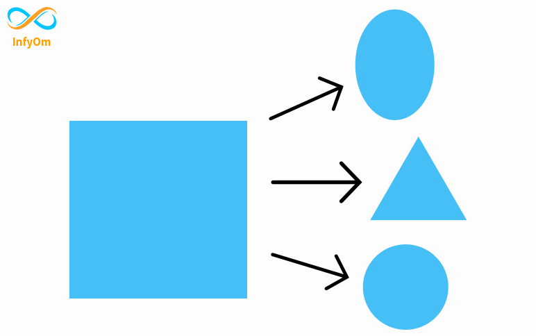
In this blog, we will learn how to use clip-path and also cover inset(), polygon(), circle(), and ellipse() method .

What is CSS Clip-path?

Clip-path is a CSS property that creates a clipping field that sets which part of a component should be shown and which other parts are hidden. The inside of the clipped area is shown, while the outside is hidden.

CSS Property clip-path creates shapes by clipping an element. It clips some regions of an element to create new shapes. The most used method for clip-path is polygon(), circle(), and ellipse().

CSS clip-path() accepted values

These shapes can be created using basic shape functions. The basic shape functions are listed below:-

  • inset()
  • polygon()
  • circle()
  • ellipse()

inset()

The inset () function allows you to clip a component from around the coordinate system. The result is a visible rectangle. you can assign values to the margin or padding and border-radius property. but two values are limited in rounded corners. The first value is assigned to the top left corner and the bottom right corner and the second value is assigned to the top right corner and the bottom left corner.

inset

polygon()

To design or clip the rectangular parts of the viewport, we use the polygon () method. Polygon is the most commonly used method in clip-path. We can construct any shape using the polygon method.

polygon-example

Example

polygon

circle()

The below image is created by using the clip-path method circle(50% at 50% 50%). In the circle(val1 at var2 var3), val1 is the size of the radius of the circle, and val2 and val3 are the positions of the center. val2 represents the position of the center from the left of the viewport, val2 represents the position of the center from the top of the viewport.

cricle

ellipse()

Below image is created using clip-path method ellipse(25% 40% at 50% 50%). An ellipse(val1 val2 at val3 val4) val1 and val2 are the horizontal and vertical distance from the center. val3 and val4 is the position of center.

ellipse

Resources

I recommend you visit this link to play with the clip-path CSS property. You will see different types of shapes from this link. It's an imaginative place. You can customize your shape.

July 31, 20212 minutesPayal PansuriyaPayal Pansuriya