Design Posts

Which Logo File Format to Use Part-2

GIF logo file formats are not as widely used as they once were. They have a very limited color spectrum (only 256 colors out of millions in JPG) so solid color logos are a good candidate for this format. A special feature of the GIF file is that it supports smooth animation. You can create frames with frame animations and file sizes will be negligible as long as you keep the color flat and smooth (from red to blue). GIF files are pixel-based and do not expand well.

logo

EPS and AI logo file formats are a sacred grail of file formats. They are made up of dots and lines, not pixels, allowing infinite scaling and expansion without losing quality. Many business owners and executives ignore these logo file formats because they cannot open them normally. Many common MS Office fee programs do not open the EPS logo file format. EPS files can also support pixels, which also makes this file format difficult. Software such as Adobe Illustrator, InDesign, or Photoshop can work with this file format and optimize and save almost any logo file format you need. Illustrator will allow resizing, color mode change, and more.

PDF logo file formats can also be difficult as PDF color mode can disguise spectra and resolution. Some common office fee software will open or import PDFs but one way to tell if the resolution is good is to zoom in very closely to the logo. If the edges stay crisp, you’re in business and a graphic designer who can use something in print and digital applications. If the edges become blurred or pixelated, you will be limited in the use and extension of this particular logo file format.

SVG files have become more common on websites and digital access and are considered the standard format for displaying vector graphics on the web. SVG logo file formats allow a resizable logo format that does not lose image quality as it is expanded or reduced. This is especially important with responsive web design where the logo file can be resized depending on the digital device the website is viewing. Another major advantage for the SVG logo file format is the relatively small file size - which allows a digital file to load on a website very quickly. Support is limited to SVG but website design is an important place for their use.

January 08, 20212 minutesKishan SavaliyaKishan Savaliya
Which Logo File Format to Use Part-1

Multiple logo file formats

Digital logo applications such as websites and anything seen on the screen use the RGB color spectrum. This color spectrum is more varied than standard printed material so digitally used logo files are designed a little differently. They usually do not require high-resolution art and are not limited to one color.

The printed logo application like printed brochures, business cards, T-shirts, decals, folders, and ink on paper is 99% of the time prepared with CMYK and Pantone color spectrum. This spectrum is handled differently than a digital application and requires high resolution so that it looks crisp when printed on paper.

Logo File Formats

Logo file formats can come in many shapes and sizes. The format is driven by how it will be used, now and in the future, as well as what the logo looks like. When your logo designer provides the digital file formats to you, place them somewhere secure so you do not misplace them and can consistently reference the files. Below are common logo file formats that cover 99% of all logo marketing applications.

  • JPG
  • PNG
  • GIF
  • EPS
  • AI
  • PDF
  • SVG

2021-01-09-5ff9332db7b83

Which logo file formats are most common?

It is very common to have JPG or PNG logo file formats. This is most common because of many programs such as Word and PowerPoint import/drop. When you use these file formats on the screen, it is mostly acceptable. But have you ever tried to enlarge one of these file formats and the logo starts to get blurred or pixelated? This is because these formats are pixel-based and limited in how much they can be expanded before image quality deteriorates.

2021-01-09-5ff933446afc1

Breakdown of logo file formats and their best uses

The use of JPG (or JPEG) does not require digital and print, as it is the RGB and CMYK color space. If you don't have software like Photoshop, it creates colorful spots. One way to determine which large size JPG logo file can be used is to drag and drop the logo into your web browser window; You can use a digital app and some small print apps when viewing four or five-inch spots or more logos. JPG files are pixel-based and can be quite large. They also do not support PNG (listed below) as a demonstration background.

PNG Logo files are good for placing your logo on a photo above a photo or on a colored background in a digital app as it supports transparency. PNG logo file formats are widely supported on websites. PNG for any printed projects. Do not use files. PNG files are pixel-based and do not expand well.

November 24, 20202 minutesKishan SavaliyaKishan Savaliya
What is the difference between CMYK and RGB?
One of our clients once asked me to explain what CMYK means and what is the difference between it and RGB. Here's why it's important.

We discussed the need for one of their vendors to provide or convert a digital image file as CMYK. If this conversion is not done properly, the resulting image may have muddy colors and lack vibrancy that may reflect badly on your brand.

CMYK is an acronym for Cyan, Magenta, Yellow, and Key (Black) - the ink colors used in the typical four-color printing process. RGB is an acronym for red, green, and blue light colors used in digital display screens.

CMYK is a term widely used in the graphic design business and is also known as "full-color". This printing method uses a process where each ink color is printed with a specific pattern, each subtractive color overlapping to create a spectrum. In the subtractive color spectrum, the more color you overlap, the darker the color becomes. Our eyes interpret this printed color spectrum as images and words on paper or printed surfaces

Printing a four-color process is not possible with what you see on your computer monitor.

alt

RGB is an additive color spectrum. By default, any image displayed on a monitor or digital display screen will be created in RGB. In this color space, the more overlapping color you add, the lighter the resulting image. For this reason, almost every digital camera saves its images in the RGB color spectrum.

alt


RGB color spectrum is higher than CMYK.


CMYK is for printing. RGB is for digital screens. But the thing to remember is that the RGB color spectrum is larger than CMYK, so what you see on your computer monitor is not possible by printing a four-color process. When we are designing artwork for our clients, careful attention is paid when converting artwork from RGB to CMYK. In the example above, you can see how RGB images with very bright colors can see unnecessary color shifts when converting to CMYK.

At Trillion, a combination of quality devices and expert eyes results in colors that look great in whatever environment they appear in, so your brand will always look its best. Don't let RGB fool you. If your brand has experienced a mismatch between your print and digital marketing efforts and you want to improve things.
November 20, 20202 minutesKishan SavaliyaKishan Savaliya
Common Logo Design Problems

Maintaining the integrity of your brand is essential for long-term success. However, Trillion often encounters third-party logo design files that do not appear to have the highest care when created. The logos in question come to us in the form of a sponsor logo, an affiliate logo, and a certificate or award logo.

The following points are often enough that we think it is important to provide guidance so that you can avoid these pitfalls. With the help of a graphic designer, the issues of this logo below can be solved and fixed if you ever consider it in your own logo.

1. Bad lines in the logo

When the characters and design elements in the logo are drawn or modified, great care should be taken by the graphic designer. The lines and dots inside the logo should be smooth and clean. In the logo design example below, you will see how the inside line of the letter does not have a curve towards it. This is one of the most common problems we see in poorly made logos.

2020-12-28-5fe96ab0ab5fa

Logo files are made up of many dots and lines. When the logo is small, these imperfections may not be significant, but as the logo gets bigger the issue becomes more obvious and problematic. You should have a graphic designer who will fix the curves and lines of the logo. Then use the new files to replace the problem logo.

2. Improper Alignment of Logo Elements

Since graphic designers create logos, they are composing letters and design elements. They have complete control over the sizing and alignment of objects. With all this control, and especially the number of elements or characters is likely to increase that something does not adjust as it should.

2020-12-28-5fe96b194a629

As with the "bad lines" example above, a small logo size can hide problems when compared to an extended version. But on the screen or in digital access, cutting your logo the wrong way causes it to look blurry (due to pixel interpolation, solid dark pixels are divided into multiple lighter pixels). Graphic designers can adjust the arrangement of elements using the Snap-to-Grid or Snap-to-Guide feature, functions available in Adobe Creative Cloud software. This process will ensure that items are arranged just like your logo.

3. Missing Font in Logo

A logo design should always be presented as a piece of artwork composed of lines and points or pixels. Unfortunately, this is not always the case. If a graphic designer used a particular font in your logo, you may not have that font on your, or your vendor’s, computer. A missing font often leads to it being substituted by another font available on the computer. It’s a major problem that prevents anyone who doesn’t have the font to see the logo properly. This even holds true for a graphic designer trying to fix the problem.

2020-12-28-5fe96b979ad1a

As a logo is designed, fonts are commonly used either as they are, or as a starting point to be modified for the design. The important step in the logo design process is to “outline” the letters being used in the logo so they become a piece of artwork rather than letters you can edit by typing. Once this process has been done, it is not reversible and the font will no longer be required to view and reproduce the logo. Be aware that fonts can cost between $20 and $150 or more just for one weight, such as Helvetica Neue Bold.

4. The Incorrect Logo File Format

Another one of the most common issues we see with logos that are supplied to us is that they are not in the correct file format. If your graphic designer comes to you and says “it’s not the right format” it can mean a few things. However, if your designer intends on using the logo, it is not going to work.

2020-12-28-5fe96bbfa98ee

The most common incorrect file format we receive is a raster logo such as a .jpg rather than a vector logo, such as a .eps. A .jpg logo might be fine if the resolution is high enough and it does not require being produced on a color or transparent background. Vector logos will offer a graphic designer the most options, including saving the artwork to other file formats. A vector logo can be enlarged or reduced infinitely without losing quality.

5. The Incorrect Logo Color Format

A less common but potentially more challenging logo file format issue is the color mode. A logo that is being printed on paper, on a t-shirt, or being included on a website will have different color spectrum requirements. Some can be easily converted from one to another but others cannot. Again, a vector logo will offer a graphic designer the best chance to fix the issue.

2020-12-28-5fe96c33d6221

Logo Design Done Right

Providing our clients with logo designs and all of the necessary file formats they might need is an important part of our creative process. Once our design has been approved, we create full-color, 1-color, 2-color, black, and white (knockout) versions of the logo for both print and digital usage. We clearly label the files and place them into properly named folders, making it easy to find the right logo.

November 14, 20204 minutesKishan SavaliyaKishan Savaliya
What are some important qualities of graphic designers?

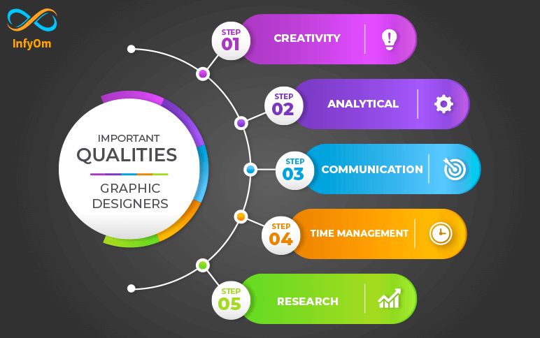
The technical skills outlined above are necessary for graphic designers to execute the actual tasks assigned to them. But there are several transferable skills needed in order to successfully bring an idea from concept to creation.

Our analysis helped us identify five important qualities employers are seeking in graphic design candidates. Here's what we found

Creativity:

This one probably goes without saying, but graphic designers are tasked with identifying creative solutions to deliver a message or solve a problem. This requires an innate ability to think outside the box and bring forth innovative ideas on a regular basis.

Analytical:

A graphic designer should be able to step outside their own mind and view the product or service analytically and from different perspectives. That way they can help anticipate how the audience will receive it.

Communication:

Graphic designers must possess strong written and oral communication skills in order to effectively work with team members and clients alike. Asking inquisitive questions helps them understand expectations so their designs will align with their client's vision.

Time management:

Designers are often faced with the challenge of working on several projects with various deadlines at the same time. Being able to juggle multiple projects and meet stringent deadlines is essential to a successful design career.

Research:

Graphic design techniques and trends are constantly evolving, which means learning is never done for designers. In order to ensure their designs are meeting client objectives, they need to be willing to dig up insights about their audience and explore new strategies.

October 19, 20201 minuteKishan SavaliyaKishan Savaliya
How to create glow effect in photoshop
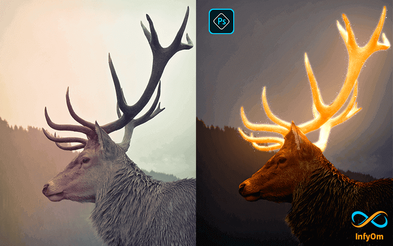
Step 1: Selection of your Subject

select any selection tool for selection but select the Quick selection tool.

select your subject and press select and mask setting

2020-12-11_5fd30647f2a82

Step 2: Edit your Subject

  1. Open property and select onion skin and transparency 50%
  2. Refine edge brush tool and then refine edge
  3. Set contrasts 9%
  4. Output setting on
  5. Tick decontaminate colors amount 100%
  6. Output to a new layer with layer mask then press OK

2020-12-11_5fd307135f8ec

Step 3: Crop the Upper part of the subject

Select layer mask and press ctrl + click for selection and new cut out the upper part to polygonal lasso tool. select perfectly then select layer and ctrl+j for duplicate layer

2020-12-11_5fd30764bf1fc

Step 4: Create an effect for Background

Create Ctrl+G for the group layer, select the last layer and create a color lookup effect.

Then 3D lut file and select moonlight.3dl. and then Create a new effect black & white Opacity set 50%

2020-12-11_5fd309224b0ce

Step 5: Create Effect for Main Subject

Select the group layer and convert this layer to a Smart Object.

Then create this layer duplicate. then create a color style to the top layer in linear Dodge(Add).

Then go to the

2020-12-11_5fd309f0a9d2c

  1. Filter - blur - Gaussian blur Create radius - 5 for soft edges
  2. Create a duplicate layer and double click on the smart filter and Create a radius of 100

2020-12-11_5fd30a00d1eea

  1. again Create a duplicate layer and double click on the smart filter and Create a radius of 2504. again Create a duplicate layer and double click on the smart filter and Create a radius of 500 then add hue/saturation adjustment layer and click on create clipping mask then click on colorize and increase the saturation to your perfect and choose a color

2020-12-11_5fd30a6250351

Step 6: Create All effects in the subject

Select the main layer mask image and create effect curves.

And click on create effect curves and click on create clipping mask and curves per requirement select layer mask and select the brush tool. and set property opacity 100%flow 30%

2020-12-11_5fd30ab6dfb02

Create a duplicate hue/saturation effect layer and set this layer to the bottom of the main object and select this layer and open property and click ok create a clipping mask.

And select the mask and make sure the foreground color is white.

And give shade to the object and you can also adjust the opacity.

Step 7: Add the sparkle and give effect

Let's add sparkle and change the blending yo screen.

2020-12-11_5fd30b69e1b01

Then add a mask and convert to invert the layer and select brush tool.set foreground color is white and creates an effect in the main object after creating effect open blending mode and create a level and click on create a clipping mask and set property per requirement.

Then open blending mode and select color lookup and set 3dlutfile to crisp_warm: look and set opacity as per requirement.

Now finally ready to glow effect

2020-12-11_5fd30bbe60c28

September 10, 20202 minutesKishan SavaliyaKishan Savaliya
How to Create Dripping Effect in Photoshop

Step:1 Create a new artboard

Create new artboard fill property width 1920 height 1080 resolution 75px/inch color mode RGb-8bit background white.

dripping

Step:2 Select Add a layer style

Click the lock icon to unlock the background and double click it to open click gradient overlay and the gradient bar.

dripping
Click the black & white thumbnail in the lower-left step, click the color box and pick a soft color that works with your subject.

dripping

Step:3 Set Image In artboard

Press v on your keyboard drag the photo onto the keyboard to reposition it just drag it.

dripping


Once you're happy with its size and position press enter or return next we'll septate the subject from its background by making a selection around the subject. there are many ways to do this but for this example, I'll use the quick selection tool if you're using

Step:4 Crop as a requirement

This tool as well makes its radius anywhere between 5 and 10 pixels drag the tool over the inside of your subjective selection

dripping


Step:5 Select Refine edge

Those areas to refine the selection edge click refine the edge and check smart radius that detects smooth and hard edge drags the radius a little bit to the right to adjust the size of your project make sure.

The caps lock key is off and press the right or left bracket key on your keyboard drag the brush cover all soft edges like air and press OK.

dripping


Step:6 Add Drip image

How to hook it to a new layer with a layer mask open in the background.

Ctrl-click the dripping photo to make a selection, make the original subject photoactive and press the delete icon on your keyboard click eyeball to hide the dripping pattern then be selected by pressing Ctrl+D.

dripping


Step:7 Add Brush Style

Click the new layer icon to make a new layer drag it below your subject.

dripping


Set open brush tool and brush picker take this flat seven board number 504 for brush download the splatter brush.

dripping


Step:8 Add Effect as per your Requirement

Make the subject layer active and open layer style window click drop shadow the blend mode is linear burn the color is black and the opacity is 100% the angle is 90 degrees and check the use of global light.

The distance is 5 pixels the spread is 0% and the size is 0 pixels the contour is linear and the subject is ready

dripping


August 11, 20202 minutesKishan SavaliyaKishan Savaliya
How To Change Background in Photoshop
We are going to change the background of the photo with another texture.

Step:1 Create a new artboard

Press Ctrl+N for creating a new artboard and set its dimension as per requirement. For example, here we took 4951 x 3301 px.

change-backgrond

Step:2 Set Image In artboard

Drag image from its location to the artboard.

Step:3 Select cropping portion of the image

For the selection of an image, select the quick selection tool from the toolbar, and select a portion of the image which you want to crop.

change-backgrond


Step:4 Select Refine edge

After perfect selection, select a refined edge tool.
After this select overlay from view mode then from edge detection, select a smart radius.

Then set these properties:
  1. Set radius 1 to 2 px
  2. Increase smooth 6 to 7 px from global refinements
  3. Set contrast 20% in global refinements
  4. Check to decontaminate colors in output settings and set amount 70%
  5. Set new layer with a layer mask in output dropdown
Press OK.

change-backgrond
Now our image will look like below:

change-backgrond

Step 5: set new background

Select a new background that you want to set in the image from its location and set the artboard.

Now place our cropped image above this background and adjust as per requirement.

change-backgrond
June 30, 20201 minuteKishan SavaliyaKishan Savaliya