Media queries allow you to customize the presentation of your web pages for a specific range of devices like mobile, phone, tablets, desktops, etc. without any change in markups.
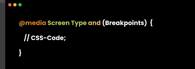
Syntax
@media Rule
The @media rule is used to apply a different set of styles for different Media/devices through the use of Media Queries.
Parenthesis
We set the condition inside the parenthesis.
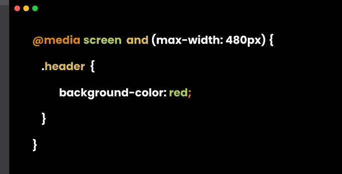
If I want the background color to be changed in the smaller screen, I can set the condition inside parenthesis.
Media Types
If we don’t apply a media type, the @media rule selects all types of devices by default.
There are many kinds of devices but we can group them into 4 categories:
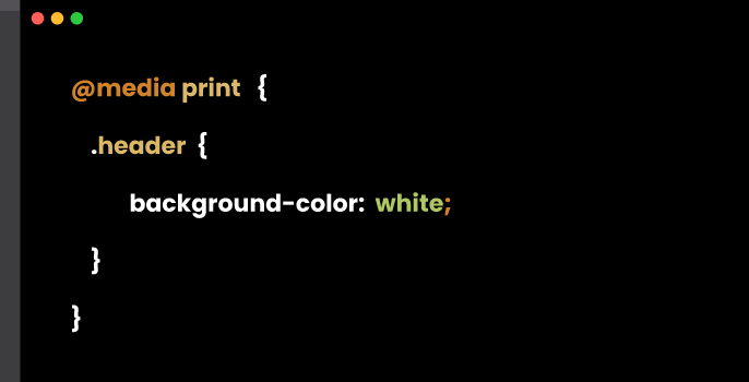
all – for all media types print – for printers screen – for computer screens, tablets and smart-phones speech – for screen readers that “read” the page out loud
Breakpoints
Breakpoints are points where the website content responds according to the device width.
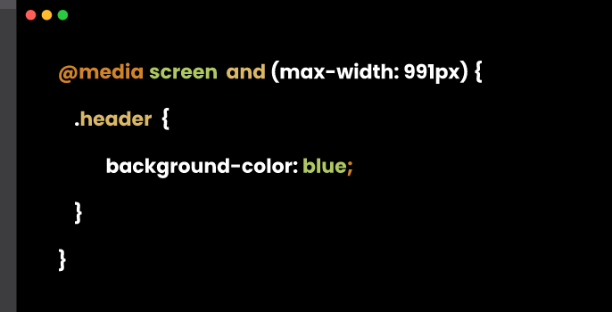
This is how the code works
when the screen is 992px or less, the background color is changed to blue from red