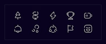
Linear
It is the most common style of icon in projects. With its simplicity, it is perfect for a minimalist and modern style.
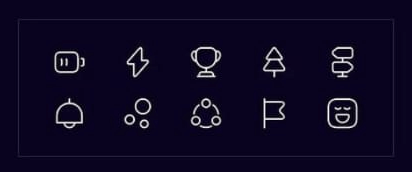
Bold
These icons have a fill. We often use them to emphasize the effect of an active option in the navigation of desktop or mobile applications.
Two colors / Duocolor
As the name suggests, it is a two-color style. this, we can distinguish their more important fragments.
Bulk
It is a combination of the two colors and bold styles. this, the icons are better visible through filling, and at some time, we can emphasize their more important parts.
Broken
This style is characterized ‘zed by a partial indentation in a given fragment of the icon. This effect distinguishes the icons from the rest and gives them a bit of spice.
