In practically every form of mobile or desktop application, website, or interface, interactivity, or user input, is anticipated. While utilizing an interface, users enter personal information, modify application settings, and navigate through various menus. It is our obligation as designers to give users the appropriate controls to make these inputs easier and faster.
Toggle switches and checkboxes, two of the most ubiquitous controls, appear to achieve the same goal, and their use cases are frequently misinterpreted as a result. However, there are a few circumstances where one or the other should be used. This blog will discuss the differences between checkboxes and toggle switches, as well as when each should be used in your user interfaces.
How to Tell the Difference Between Checkbox and Toggle Switches
There are two possibilities for checkbox controls: chosen and not selected. When the user can choose from any of the alternatives listed, the checkbox should be used. The checkbox will normally require buttons such as “Submit, OK, Next, Apply” after the box has been checked.
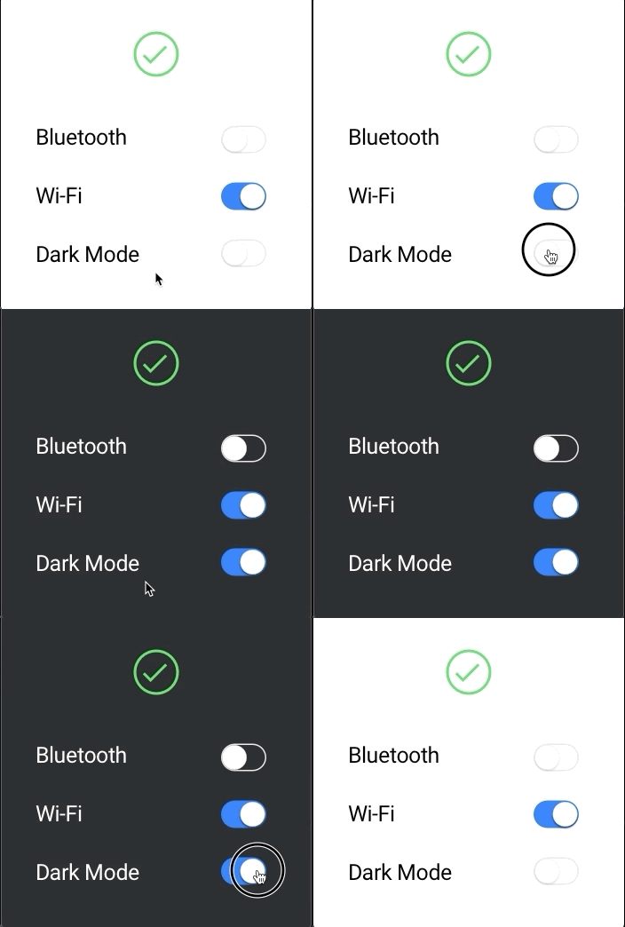
A toggle switch, like a light switch, represents a physical switch and is a “either/or” control that allows users to turn things on or off. The impacts of switching a light switch are felt quickly, much like flipping a light switch. Toggle switches in the user interface have the same trait.
Switches can assist mobile users in a variety of ways. In comparison to checkboxes, switches have a larger touchpoint to engage with and can deliver greater haptic feedback.
A toggle switch requires two steps: selection and execution, whereas a checkbox requires only the selection of an option, and the execution/saving action is normally required later or at a different area.
A few use-cases are provided below to assist you in determining which control is best for your user interface.
When to Use a Toggle Switch
- Without review or confirmation, an immediate response is required.
- An on/off or show/hide operation is required for a setting.
When to Use Checkboxes
- Before submitting any options, the user must confirm or evaluate them.
- For modifications to take effect, the user must take additional actions.
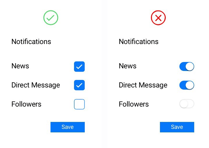
- There are several possibilities accessible, and the user must choose one or more of them.
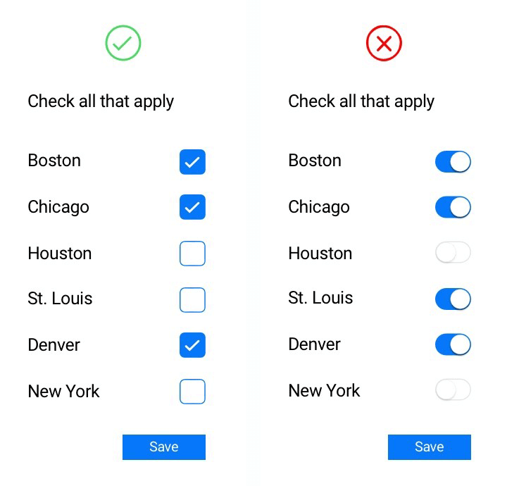
- There is only one yes/no option, or only one alternative may be picked, and the message is evident.
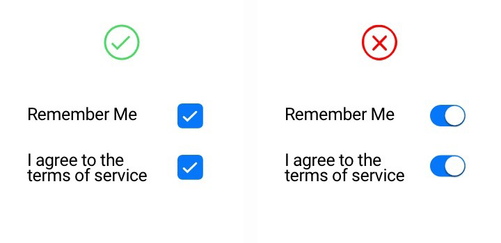
- You want to provide two alternatives for an on/off decision when the user is toggling separate features or behaviors.
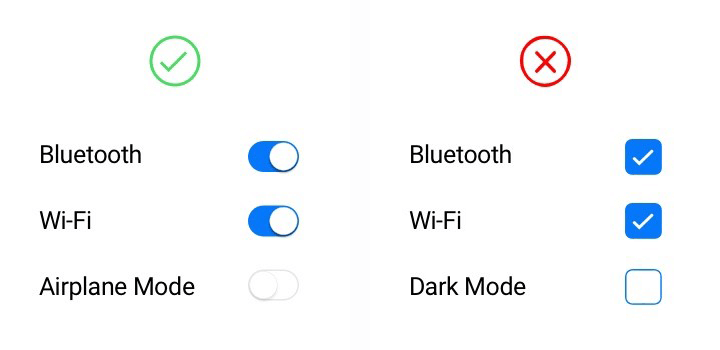
Focus on context rather than function when choosing between a switch and a checkbox. Consider if a setting should take effect right away. Ask yourself whether users need to check their settings before they apply them.
