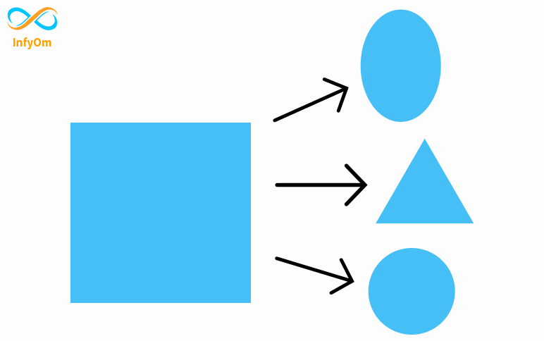
In this blog, we will learn how to use clip-path and also cover inset(), polygon(), circle(), and ellipse() method .
What is CSS Clip-path?
Clip-path is a CSS property that creates a clipping field that sets which part of a component should be shown and which other parts are hidden. The inside of the clipped area is shown, while the outside is hidden.
CSS Property clip-path creates shapes by clipping an element. It clips some regions of an element to create new shapes. The most used method for clip-path is polygon(), circle(), and ellipse().
CSS clip-path() accepted values
These shapes can be created using basic shape functions. The basic shape functions are listed below:-
- inset()
- polygon()
- circle()
- ellipse()
inset()
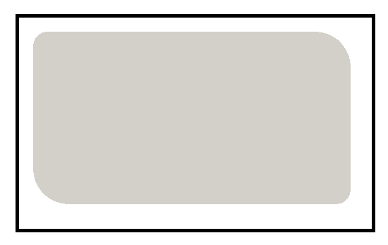
The inset () function allows you to clip a component from around the coordinate system. The result is a visible rectangle. you can assign values to the margin or padding and border-radius property. but two values are limited in rounded corners. The first value is assigned to the top left corner and the bottom right corner and the second value is assigned to the top right corner and the bottom left corner.
polygon()
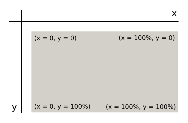
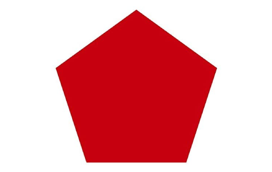
To design or clip the rectangular parts of the viewport, we use the polygon () method. Polygon is the most commonly used method in clip-path. We can construct any shape using the polygon method.
Example
circle()
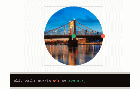
The below image is created by using the clip-path method circle(50% at 50% 50%). In the circle(val1 at var2 var3), val1 is the size of the radius of the circle, and val2 and val3 are the positions of the center. val2 represents the position of the center from the left of the viewport, val2 represents the position of the center from the top of the viewpor
ellipse()
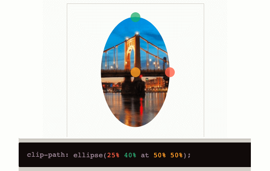
Below image is created using clip-path method ellipse(25% 40% at 50% 50%). An ellipse(val1 val2 at val3 val4) val1 and val2 are the horizontal and vertical distance from the center. val3 and val4 is the position of center.
Resources
I recommend you visit this link to play with the clip-path CSS property. You will see different types of shapes from this link. It’s an imaginative place. You can customize your shape.
