Exploring AI-Based Tools in Adobe Photoshop
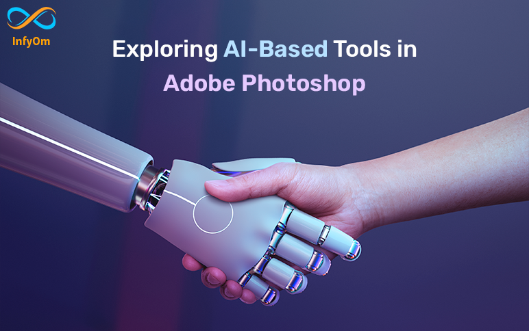
Unlock the power of artificial intelligence in Adobe Photoshop with our comprehensive guide to exploring AI-based…
The Role of Graphic Design in Social Media Marketing
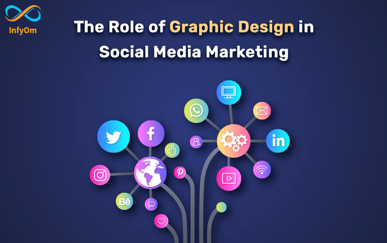
If you’re looking to take your social media marketing to the next level, consider investing in graphic design…
Design Ethics: Making the Right Choices in Design
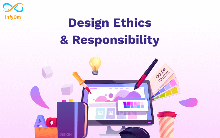
As graphic designers, we have a unique opportunity to shape the way people perceive information and the world around…
How Open AI can help you create Impressive Visuals
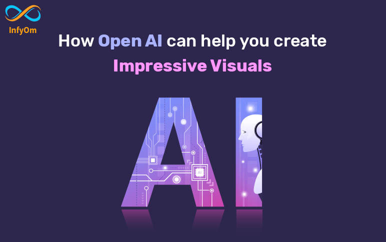
AI design tools develop images based on user preferences and real-world data using algorithms and machine…
The Elements of the Ideal Logo
While logos are essential to the success of your company, creating one may be challenging. The perfect logo should…
Useful Figma Tricks to Work Faster
Whether you’re new to Figma or an expert user, you’ve probably realised that there are always more…
Top 5 UI/UX Design Tools
UX and UI tools have played a pivotal role in shaping the digital economy since their inception. If a tool, no matter…
Understand FontIcon Style
Linear It is the most common style of icon in projects. With its simplicity, it is perfect for a minimalist and modern…
Why to use Figma over other UI Design Tools?
The program can be used in any browser and operating system, it is also possible to save offline projects as…
User Interface Design Tips: Checkbox vs Toggle Switch
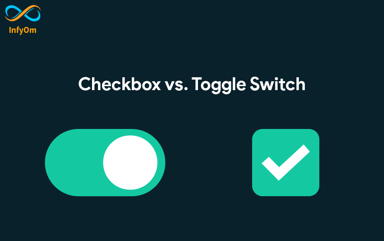
A toggle switch, like a light switch, is a physical switch that allows users to turn objects on and…