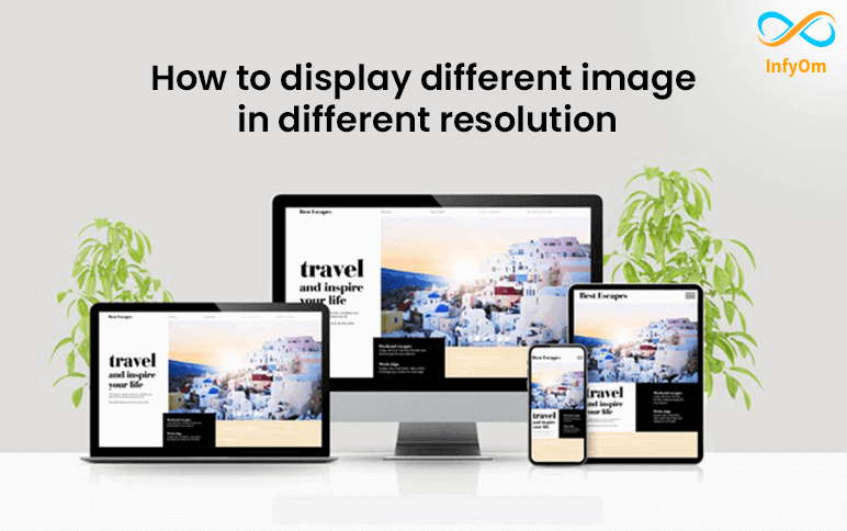
Today we are going to see how we can image based on resolution. We have the most common issue of loading big images in small devices take time. So, the basic solution is to use the picture element to load a different image in different devices and resolutions.
The <picture> element will be for the art direction of responsive design.
The element contains two tags.
- <source>
- <img>
So, the browser will look for the first <source> element where the media query matches the current width, and then it will display the image. The <picture> element is required as the last child of the <picture> element.
Let me show you an example of how to display a different image in different widths.
Here is a Code example,
					<picture>
    <source media="(min-width:900px)" srcset="infyom_logo_lg.jpg">
    <source media="(min-width:700px)" srcset="infyom_logo_md.jpg">
    <source media="(min-width:500px)" srcset="infyom_logo_sm.jpg">
    <img decoding="async" src="infyom_logo_xl.jpg" alt="Flowers" style="width:auto;">
</picture>


