Digital logo applications such as websites and anything seen on the screen use the RGB color spectrum. This color spectrum is more varied than standard printed material so digitally used logo files are designed a little differently. They usually do not require high-resolution art and are not limited to one color.
The printed logo application like printed brochures, business cards, T-shirts, decals, folders, and ink on paper is 99% of the time prepared with CMYK and Pantone color spectrum. This spectrum is handled differently than a digital application and requires high resolution so that it looks crisp when printed on paper.
Logo File Formats
Logo file formats can come in many shapes and sizes. The format is driven by how it will be used, now and in the future, as well as what the logo looks like. When your logo designer provides the digital file formats to you, place them somewhere secure so you do not misplace them and can consistently reference the files. Below are common logo file formats that cover 99% of all logo marketing applications.
JPG
PNG
GIF
EPS
AI
PDF
SVG
Which logo file formats are most common?
It is very common to have JPG or PNG logo file formats. This is most common because of many programs such as Word and PowerPoint import/drop. When you use these file formats on the screen, it is mostly acceptable. But have you ever tried to enlarge one of these file formats and the logo starts to get blurred or pixelated? This is because these formats are pixel-based and limited in how much they can be expanded before image quality deteriorates.
Breakdown of logo file formats and their best uses
The use of JPG (or JPEG) does not require digital and print, as it is the RGB and CMYK color space. If you don't have software like Photoshop, it creates colorful spots. One way to determine which large size JPG logo file can be used is to drag and drop the logo into your web browser window; You can use a digital app and some small print apps when viewing four or five-inch spots or more logos. JPG files are pixel-based and can be quite large. They also do not support PNG (listed below) as a demonstration background.
PNG Logo files are good for placing your logo on a photo above a photo or on a colored background in a digital app as it supports transparency. PNG logo file formats are widely supported on websites. PNG for any printed projects. Do not use files. PNG files are pixel-based and do not expand well.
One of our clients once asked me to explain what CMYK means and what is the difference between it and RGB. Here's why it's important.
We discussed the need for one of their vendors to provide or convert a digital image file as CMYK. If this conversion is not done properly, the resulting image may have muddy colors and lack vibrancy that may reflect badly on your brand.
CMYK is an acronym for Cyan, Magenta, Yellow, and Key (Black) - the ink colors used in the typical four-color printing process. RGB is an acronym for red, green, and blue light colors used in digital display screens.
CMYK is a term widely used in the graphic design business and is also known as "full-color". This printing method uses a process where each ink color is printed with a specific pattern, each subtractive color overlapping to create a spectrum. In the subtractive color spectrum, the more color you overlap, the darker the color becomes. Our eyes interpret this printed color spectrum as images and words on paper or printed surfaces
Printing a four-color process is not possible with what you see on your computer monitor.
RGB is an additive color spectrum. By default, any image displayed on a monitor or digital display screen will be created in RGB. In this color space, the more overlapping color you add, the lighter the resulting image. For this reason, almost every digital camera saves its images in the RGB color spectrum.
RGB color spectrum is higher than CMYK.
CMYK is for printing. RGB is for digital screens. But the thing to remember is that the RGB color spectrum is larger than CMYK, so what you see on your computer monitor is not possible by printing a four-color process. When we are designing artwork for our clients, careful attention is paid when converting artwork from RGB to CMYK. In the example above, you can see how RGB images with very bright colors can see unnecessary color shifts when converting to CMYK.
At Trillion, a combination of quality devices and expert eyes results in colors that look great in whatever environment they appear in, so your brand will always look its best. Don't let RGB fool you. If your brand has experienced a mismatch between your print and digital marketing efforts and you want to improve things.
The technical skills outlined above are necessary for graphic designers to execute the actual tasks assigned to them. But there are several transferable skills needed in order to successfully bring an idea from concept to creation.
Our analysis helped us identify five important qualities employers are seeking in graphic design candidates. Here's what we found
Creativity:
This one probably goes without saying, but graphic designers are tasked with identifying creative solutions to deliver a message or solve a problem. This requires an innate ability to think outside the box and bring forth innovative ideas on a regular basis.
Analytical:
A graphic designer should be able to step outside their own mind and view the product or service analytically and from different perspectives. That way they can help anticipate how the audience will receive it.
Communication:
Graphic designers must possess strong written and oral communication skills in order to effectively work with team members and clients alike. Asking inquisitive questions helps them understand expectations so their designs will align with their client's vision.
Time management:
Designers are often faced with the challenge of working on several projects with various deadlines at the same time. Being able to juggle multiple projects and meet stringent deadlines is essential to a successful design career.
Research:
Graphic design techniques and trends are constantly evolving, which means learning is never done for designers. In order to ensure their designs are meeting client objectives, they need to be willing to dig up insights about their audience and explore new strategies.
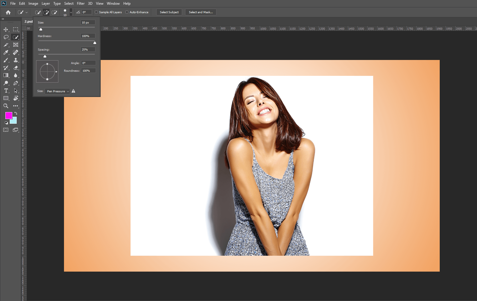
select any selection tool for selection but select the Quick selection tool.
select your subject and press select and mask
setting
Step 2: Edit your Subject
Open property and select onion skin and transparency 50%
Refine edge brush tool and then refine edge
Set contrasts 9%
Output setting on
Tick decontaminate colors amount 100%
Output to a new layer with layer mask then press OK
Step 3: Crop the Upper part of the subject
Select layer mask and press ctrl + click for selection and new cut out the upper part to polygonal lasso tool. select perfectly then select layer and ctrl+j for duplicate layer
Step 4: Create an effect for Background
Create Ctrl+G for the group layer, select the last layer and create a color lookup effect.
Then 3D lut file and select moonlight.3dl. and then Create a new effect black & white Opacity set 50%
Step 5: Create Effect for Main Subject
Select the group layer and convert this layer to a Smart Object.
Then create this layer duplicate. then create a color style to the top layer in linear Dodge(Add).
Create a duplicate layer and double click on the smart filter and Create a radius of 100
again Create a duplicate layer and double click on the smart filter and Create a radius of 2504. again Create a duplicate layer and double click on the smart filter and Create a radius of 500 then add hue/saturation adjustment layer and click on create clipping mask then click on colorize and increase the saturation to your perfect and choose a color
Step 6: Create All effects in the subject
Select the main layer mask image and create effect curves.
And click on create effect curves and click on create clipping mask and curves per requirement select layer mask and select the brush tool. and set property opacity 100%flow 30%
Create a duplicate hue/saturation effect layer and set this layer to the bottom of the main object and select this layer and open property and click ok create a clipping mask.
And select the mask and make sure the foreground color is white.
And give shade to the object and you can also adjust the opacity.
Step 7: Add the sparkle and give effect
Let's add sparkle and change the blending yo screen.
Then add a mask and convert to invert the layer and select brush tool.set foreground color is white and creates an effect in the main object after creating effect open blending mode and create a level and click on create a clipping mask and set property per requirement.
Then open blending mode and select color lookup and set 3dlutfile to crisp_warm: look and set opacity as per requirement.
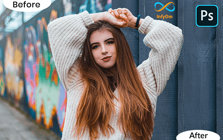
Create new artboard fill property width 1920 height 1080 resolution 75px/inch color mode RGb-8bit background white.
Step:2 Select Add a layer style
Click the lock icon to unlock the background and double click it to open click gradient overlay and the gradient bar.
Click the black & white thumbnail in the lower-left step, click the color box and pick a soft color that works with your subject.
Step:3 Set Image In artboard
Press v on your keyboard drag the photo onto the keyboard to reposition it just drag it.
Once you're happy with its size and position press enter or return next we'll septate the subject from its background by making a selection around the subject. there are many ways to do this but for this example, I'll use the quick selection tool if you're using
Step:4 Crop as a requirement
This tool as well makes its radius anywhere between 5 and 10 pixels drag the tool over the inside of your subjective selection
Step:5 Select Refine edge
Those areas to refine the selection edge click refine the edge and check smart radius that detects smooth and hard edge drags the radius a little bit to the right to adjust the size of your project make sure.
The caps lock key is off and press the right or left bracket key on your keyboard drag the brush cover all soft edges like air and press OK.
Step:6 Add Drip image
How to hook it to a new layer with a layer mask open in the background.
Ctrl-click the dripping photo to make a selection, make the original subject photoactive and press the delete icon on your keyboard click eyeball to hide the dripping pattern then be selected by pressing Ctrl+D.
Step:7 Add Brush Style
Click the new layer icon to make a new layer drag it below your subject.
Set open brush tool and brush picker take this flat seven board number 504 for brush download the splatter brush.
Step:8 Add Effect as per your Requirement
Make the subject layer active and open layer style window click drop shadow the blend mode is linear burn the color is black and the opacity is 100% the angle is 90 degrees and check the use of global light.
The distance is 5 pixels the spread is 0% and the size is 0 pixels the contour is linear and the subject is ready